Tips for Designing App Icon

5 Tips for Designing the Impeccable Mobile App Icon

Here Are Tips for Designing App Icon

First Tip for Designing App Icon Keep - It Simple:
Flat Icons are always a good choice. Icons are meant to please the eye and show professionalism with a refined look. The more colours and designs you add, the less you will be noticed. Your icon should be simple, neat and comprehensible.Second Tip for Designing App Icon - Know Your Audience:
When designing an icon for your mobile app, select an icon that doesn't offend any cultural background of the audience. We live in a world of different cultures and use symbols that are universal for people of all cultures.Third - Scale Your Icons:
What are icons for? Icons are about communicating and clarifying which could only be done with sharp images. Using non-integral numbers will make your icon design blur, try using whole number dimensions to give your icon layout a refined look. It is not just good for icon design, but for a as well. Because the icon is going to be shown in numerous places throughout different mediums and in several sizes, so, your icon design must maintain its legibility and uniqueness in every medium. The appearance of the icon design needs to look good on the App Stores, on Retina devices and even in all settings panels.Forth Tip - Be Unique:
An icon for a mobile app has to be simple yet unique. A mobile has got various icons in it, to make your icon design stand out you must show creativity and uniqueness in the design. The general icon designs are often overlooked so avoid using them.Fifth Tip - Colour Selection:
give it a start with two to three colours and not more than that, stuffing your icon design with colours is not the right approach. People do not like overdone things, just how you will not feel good if overdone so the same is true with the design. The audience quickly memorizes a design that is simple with smooth colours, unlike the funky designs. Conclusion: Icon design is a pictograph of your mobile application, don't mix it with words, it could be fine to use a single letter in your icon design but do not stuff your design with words. Your brand name and logo in a square is not a good way, your icon is your strongest connection on the App Store so don't weaken it. Make these tiny pieces of design the most appealing ones to make your brand stand differently.Author Bio:
Carissa Melvin is a blogger, singer and marketer. She is addicted to mobile apps and viral media trends. She helps to share extensive knowledge with those who look for better mobile apps, web designs and branding.Read also about the Best loan applications In Kenya


Recommended Affiliate Resources


You May Also Like

Will AI Replace Programmers?
The rise of artificial intelligence (AI) has many programmers asking a pressing question: "Will my job be…
Read More »
The Complete Guide to Laptop Overheating
Few things frustrate computer users more than a laptop that suddenly becomes hot, noisy, and painfully slow.…
Read More »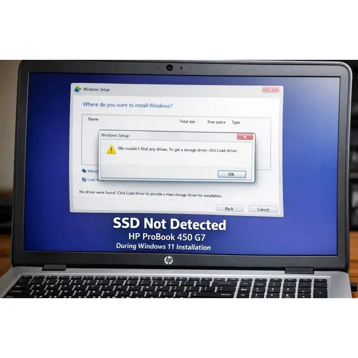
HP ProBook 450 G7 SSD Not Detected During Windows 11 Installation
Few things are more frustrating than preparing everything correctly for a clean Windows installation, only to…
Read More »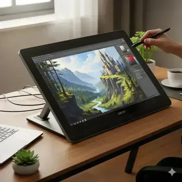
Best Creative Artist Companion: Wacom Cintiq Pro Series Review
Wacom Cintiq Pro Series Review Discover why the Wacom Cintiq Pro Series is the preferred choice for creative…
Read More »
Galaxy S25 FE Review: Why It’s the Perfect Smartphone
Discover why the Galaxy S25 FE is the perfect blend of premium features and budget-friendly pricing. In the…
Read More »
Why Won’t My PC Turn On? Fixes That Work
One moment, your desktop is humming along just fine; the next, the power button does absolutely nothing. No…
Read More »Traffic Coop Earnings
Ready to Monetise Your Traffic?
Stop letting your visitors slip away without value. With the LeadsLeap Co-op, you can turn every click into income. Join through my link below and I’ll personally share my tips for getting started fast.
Join My LeadsLeap Co-op Now
About the Author
Hello, I'm Patrick Wilson — an entrepreneur, artist, and storyteller driven by curiosity and passion. Through this blog, I explore and share meaningful content around a wide spectrum of lifestyle and success topics that matter to everyday people looking to live better, earn more, and grow intentionally.
From building a personal brand and making money online through proven digital strategies, to navigating the journey of personal finance and wealth-building — I bring real-world insights and tools to help you take control of your financial future.
I also document my pursuit of a healthy, balanced life — sharing inspiration around achieving fitness goals and living with purpose. As someone who appreciates both the aesthetic and the soulful, I dive deep into fine art, cultural history, and the enriching nuances of everyday lifestyle.
Whether I'm exploring breathtaking travel destinations across the globe or tending to the joys of home and garden, I aim to bring beauty, clarity, and useful ideas to every post.
If you're passionate about growth — financially, creatively, or personally — this blog is designed to inspire and support your journey.
Thanks for being here — let's grow together.